Most local business owners assume that a quiet phone means a traffic problem. So they buy more ads, ask for more SEO, or rewrite their homepage headline again. Then the analytics report comes back showing hundreds of visitors a month and the inquiry count is still close to zero.
Traffic and inquiries are two different jobs. Getting found is job one. Getting chosen is job two. A site can be excellent at the first and hopeless at the second, and the numbers will look healthy right up until you check the only figure that matters, which is how many real people contacted you this month.
Here is how we diagnose a site that gets visitors and produces nothing, in the order we actually work through it.
Start by confirming the traffic is real
Before you fix conversion, confirm you have something to convert. Three checks settle it quickly.
Look at which pages the traffic lands on. If almost all of it hits blog posts about general topics and almost none hits your service pages, you do not have a conversion problem, you have a relevance problem. Informational readers were never going to call.
Look at the locations. Local service businesses regularly discover that a large share of their sessions come from outside their service area, and sometimes from outside the country. Those visitors cannot become customers no matter how good the page is.
Look at time on page and scroll depth for your main service pages. If the average visit is under ten seconds, the page is failing in the first screen, not in the contact form.
If the traffic survives those three checks and inquiries are still flat, the problem is on the page.
The five things that quietly kill inquiries
1. The first screen does not answer the three questions
Someone who lands on your site is silently asking what you do, whether you do it near them, and what happens next. If the top of the page opens with a slogan, a stock photo, and a vague promise about excellence, they have to work to answer those questions, and most will not.
The fix is unglamorous. State the service, state the area you serve, and put the next step within reach. A visitor should be able to read the top of the page and say out loud what you do and where you do it.
2. There is no obvious next step, or there are nine of them
We regularly audit sites with a call button, a contact form, a chat widget, a newsletter signup, a downloadable guide, and a link to a booking tool, all competing on the same screen. Choice feels generous. In practice it splits attention and nothing gets clicked.
Pick one primary action. On most local sites that is either a phone call or a short inquiry form. Everything else becomes secondary, smaller, and further down. Repeat that single action at the top, in the middle, and at the end of the page.
3. The form asks for more than a stranger will give
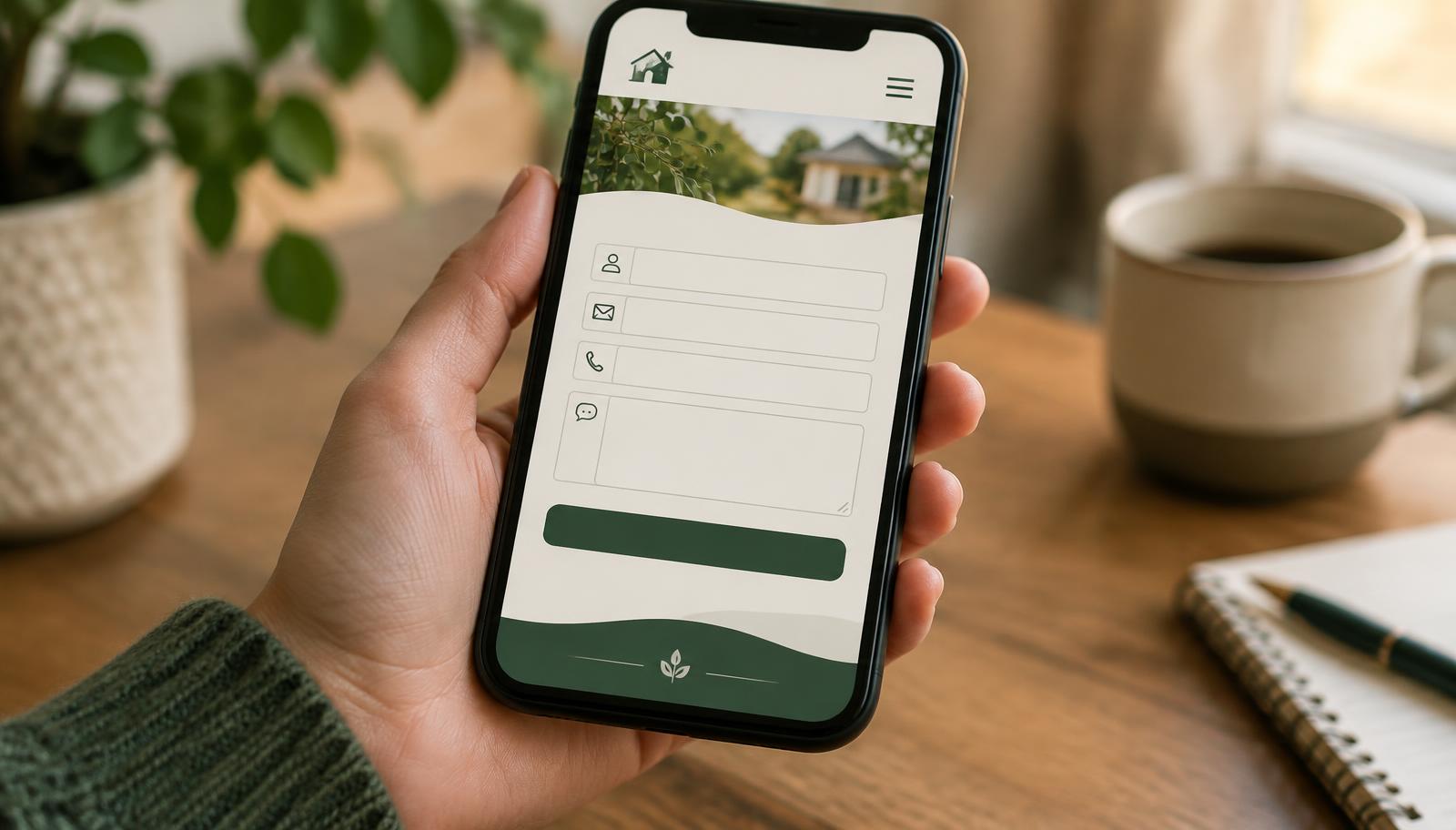
A first contact form is not an intake form. Every extra field costs you inquiries, and the cost is steepest on fields that feel invasive before any trust exists: date of birth, insurance details, full address, budget, a long free-text box with no guidance.
Name, contact method, and a one-line description of what they need is enough to start a conversation. Collect the rest after they are talking to you, not before.
4. Nothing on the page proves you are real
Cold visitors who have never heard of you are deciding whether you are a real business with real customers. Sites that convert show evidence of that early. Reviews with names attached. Photos of the actual space and the actual team. Years in business. Specific outcomes rather than adjectives.
Sites that do not convert tend to lean on stock imagery and general claims about being trusted and dedicated. Those sentences are free to write, so they carry no weight.
5. Nobody answers
This is the one owners least expect and it is often the largest single leak. The page can be perfect and the inquiry still dies in the gap between the form being submitted and someone responding. Inquiries that sit for hours usually book with whoever replied first, and you never see that in your website analytics. The site looks like it is failing when the follow-up process is what failed.